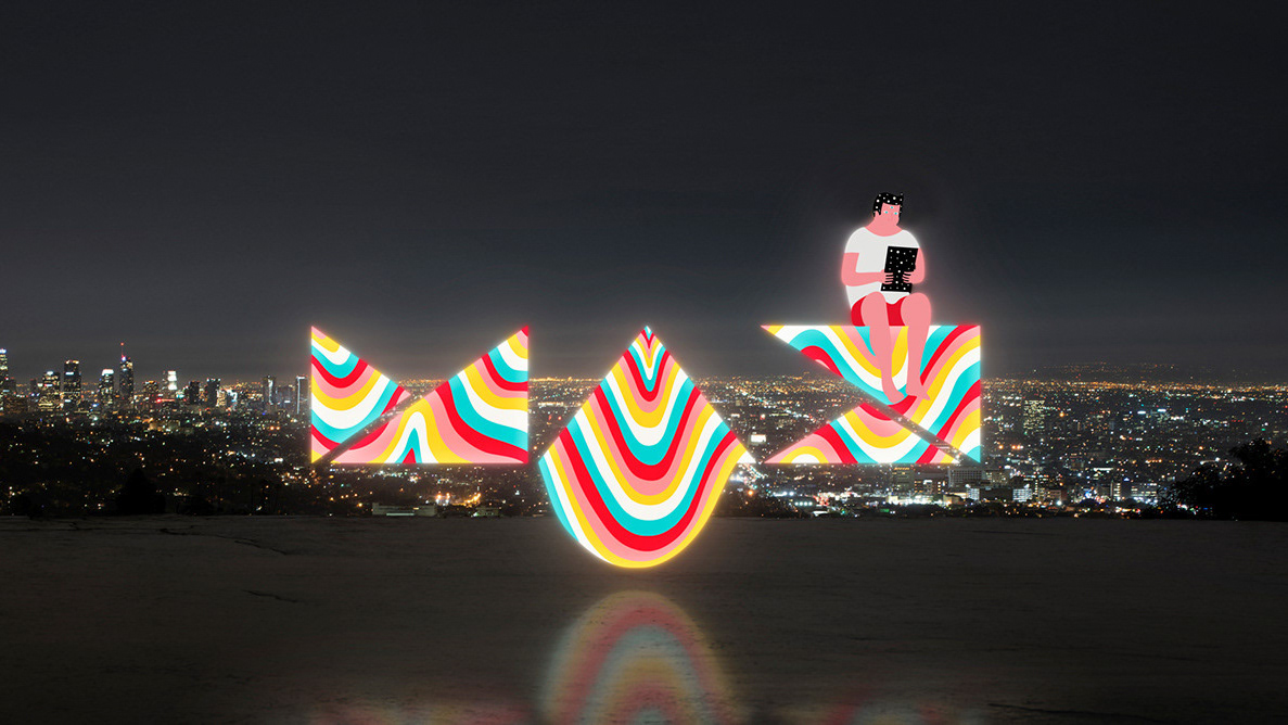
MAX Identity 2021: Animated Logotype
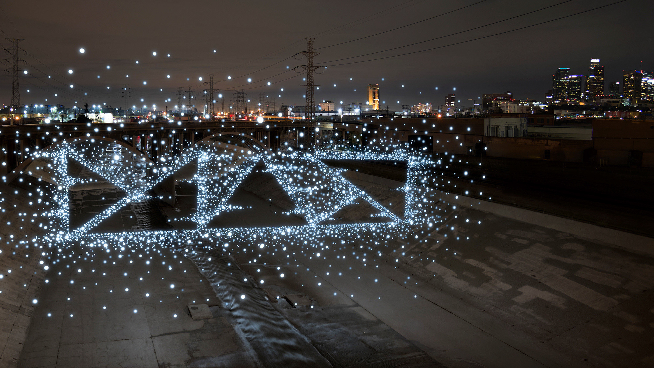
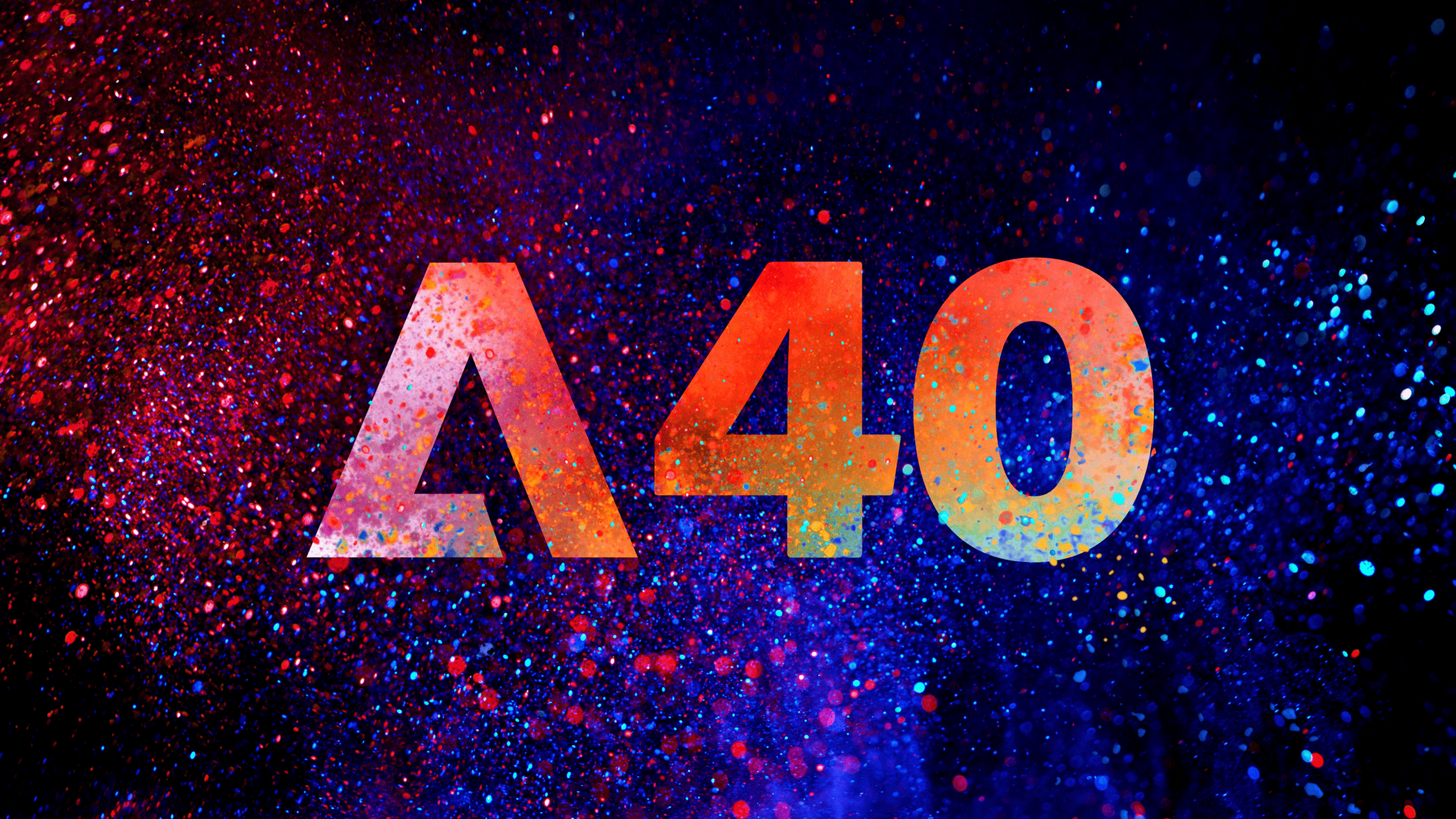
There were three components of the MAX identity this year. Design-wise I was mostly involved with this MAX logotype treatment. There are multiple expressions of this treatment. This montage shows the color treatments which correspond to Creative Cloud product category colors, and a more special-purpose dark treatment. The modeling and animation was all done within after effects using Element 3D. Variations on the letterforms were explored to find shapes that balanced legibility with finding interesting intersections of light and shadow - regardless of the positioning of lights.
See the Adobe MAX 2021 project for a more in-depth case study of our team's MAX 2021 design system.
See the Adobe MAX 2021 project for a more in-depth case study of our team's MAX 2021 design system.
